Mobile Design
-
I redesigned the UI with the goals to enhance the store management; and customer interaction about Out of Stock or Order mistakes. The project lead me to discovering an algorithm improvement and user insights in real workplaces.

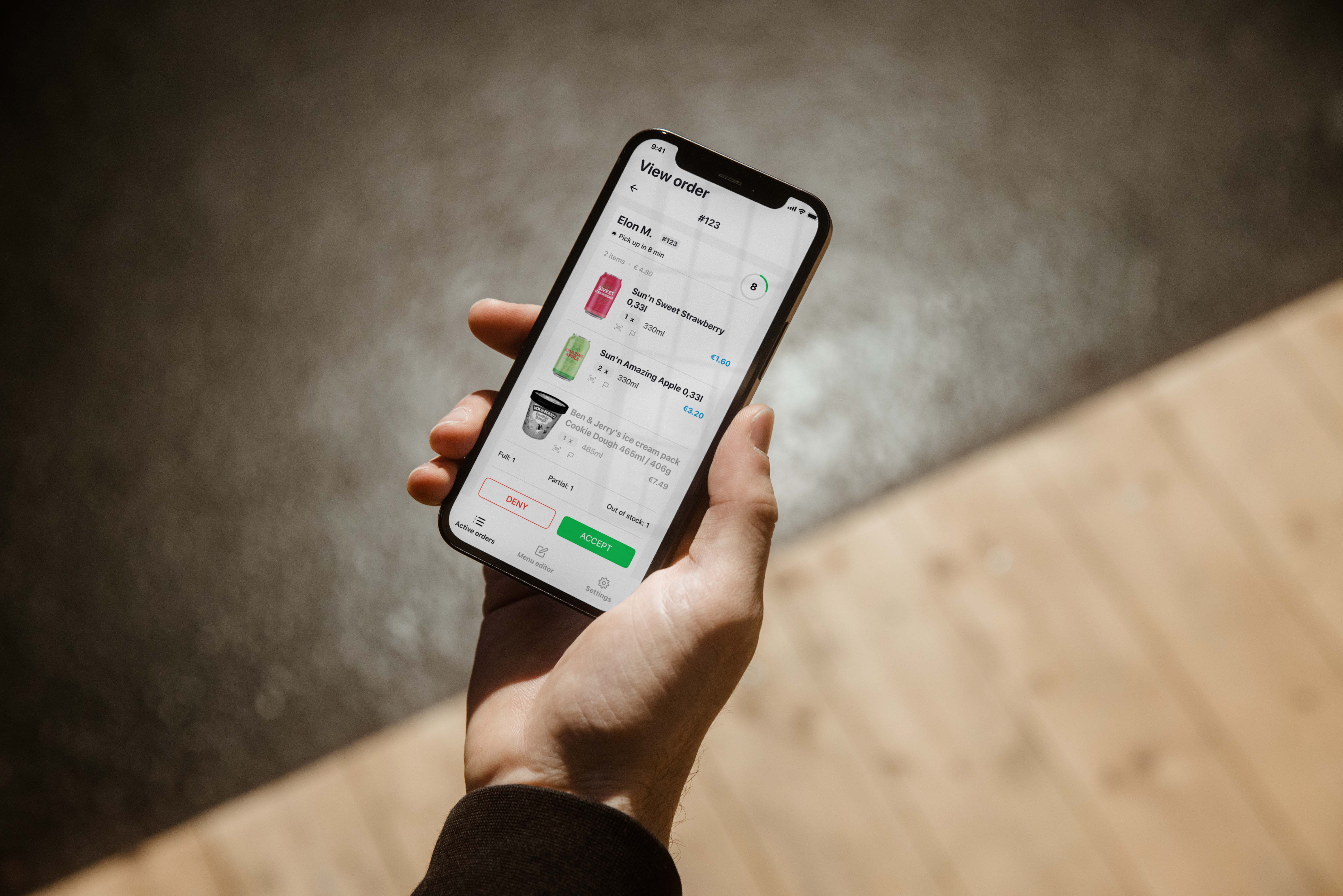
The Wolt Merchant Partner app provided to restaurants and shops for managing customer orders and interacting with couriers for accurate delivery time. After confirming orders on the app, customers are about to wait for those to be accepted by the restaurants and be processed to nearest couriers.
Wolt expanded their service from food delivery to grocery and planned to build a feature for better sorting and to inform customers about products like Out of stock or Not enough items. After mapping out the user journey, I discovered 1 critical issue about time estimation; and 4 functional approaches between shopkeepers, current customers and future customers.

Informing customers with an auto-message that none of the items can be sent, then auto-update on the system.
In case that there is just some of the items can be sent (e.x 8 out of 10). Customers are informed with the available items so that they won’t be surprised when receiving orders.
This is only for the system update and the status will be shown to the next customers and save time for them to select other products or another store. Also saving time for shopkeepers in reporting Out of Stock.
For some reasons, customers might make a mistake, e.x 100 items instead of 10, as well as just something confusing to the picker.
The current algorithm calculates the distance between the nearest courier and the restaurants or shops. But, how about the preparation time? If it takes 5 mins for a courier to arrive at pick up but 20 mins for preparing, will this require more work for the picker?
Through brainstorming processes, I started to plan my interface solutions and compare what could be done to improve from Wolt’s current design. From each iteration, I applied usability principles and learned something valuable. Some helped me evaluate how effective UX best practices used in real work and some motivated me to explore deeper with user interviews.

My changes with the number of items to Red, Collected with Green and Waiting with Yellow let users navigate through stages without the burden of reading and checking word by word.
I experimented with different viewpoints of users in processing the orders, including: barcode scan, report feature, product states, and category applied. The goal was to measure how much information users would perceive while completing the tasks with complicated elements.
As I was making progress for accurate report interactions, I was thinking about what would be an easy way to explain the capability of the app to users such as via tutorial, or a training, or creating a simple flow as much as possible. Yes, it took me a couple nights with user-flow brainstorming and sketching.
Then I have these new steps in which users can split the issue into smaller tasks and be able to completely focus on the one they are solving.
In a dynamic environment require fast responses, users naturally engage with the product based on their instincts. I created the layout for Active Orders following the principle of “Users don’t read, they scan”. Therefore, the stages of Incoming and Outgoing, main buttons were set in Blue-brand color. But in Ready’s, Collected and Waiting had their own color to separate the state they were holding with Ready and View.
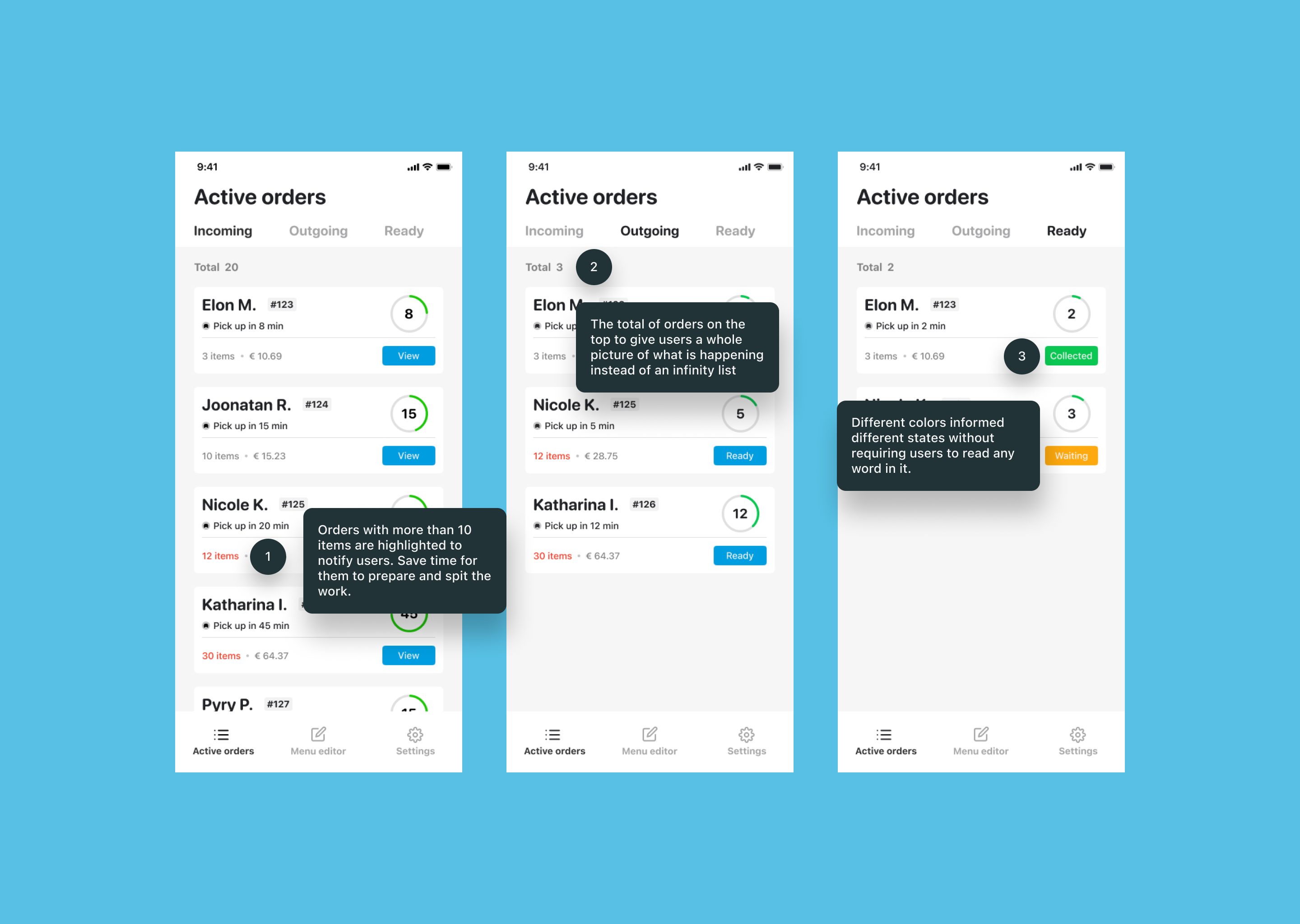
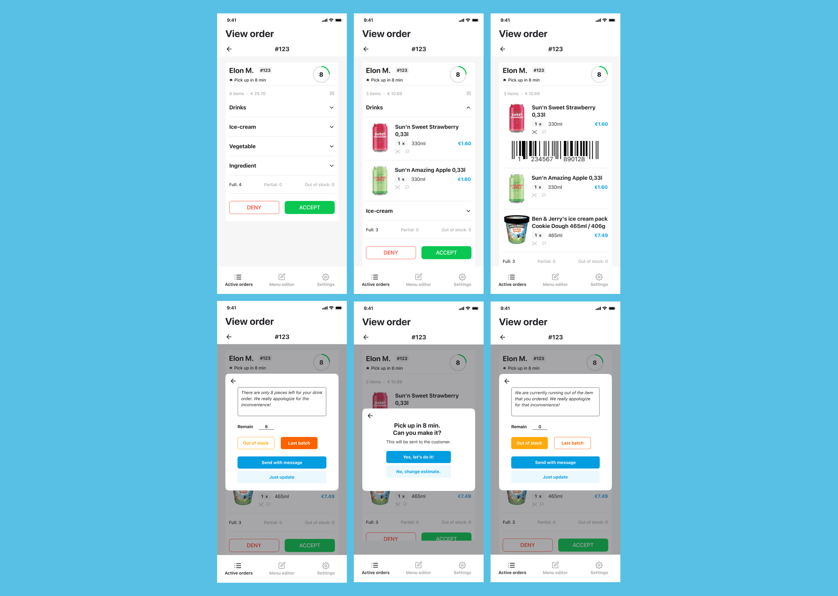
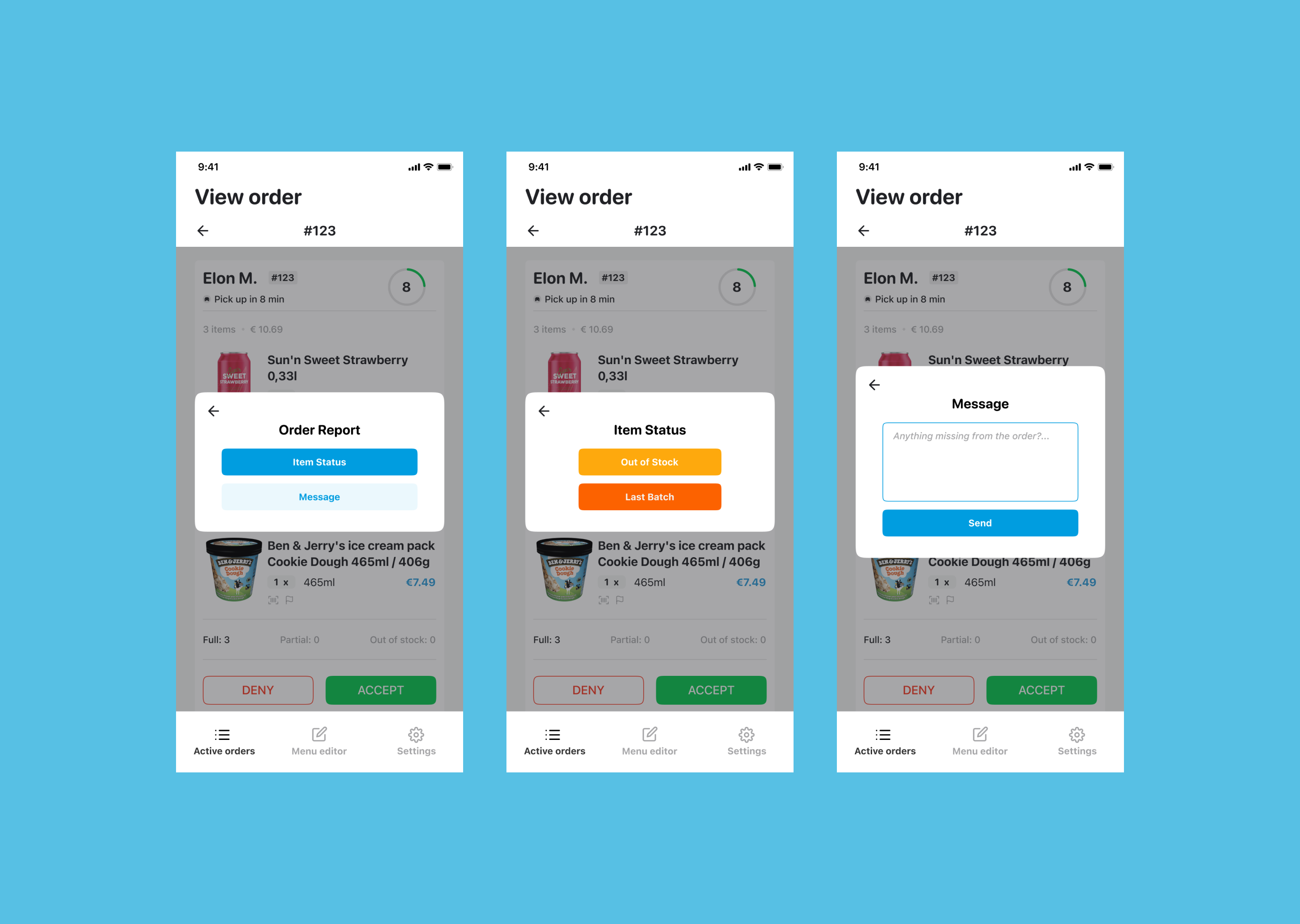
Moving to main functions of View Order with Filter, Show Barcode, Report, and Item Status. The Filter contains Normal view and Categories view. It was created to help users group nearby items and take those which are placed next to each other instead of running around the shop. For example, if there is an ice-cream put between 2 cans of drinks, grouping can lead users to collect those cans then move to the ice-cream fridge.

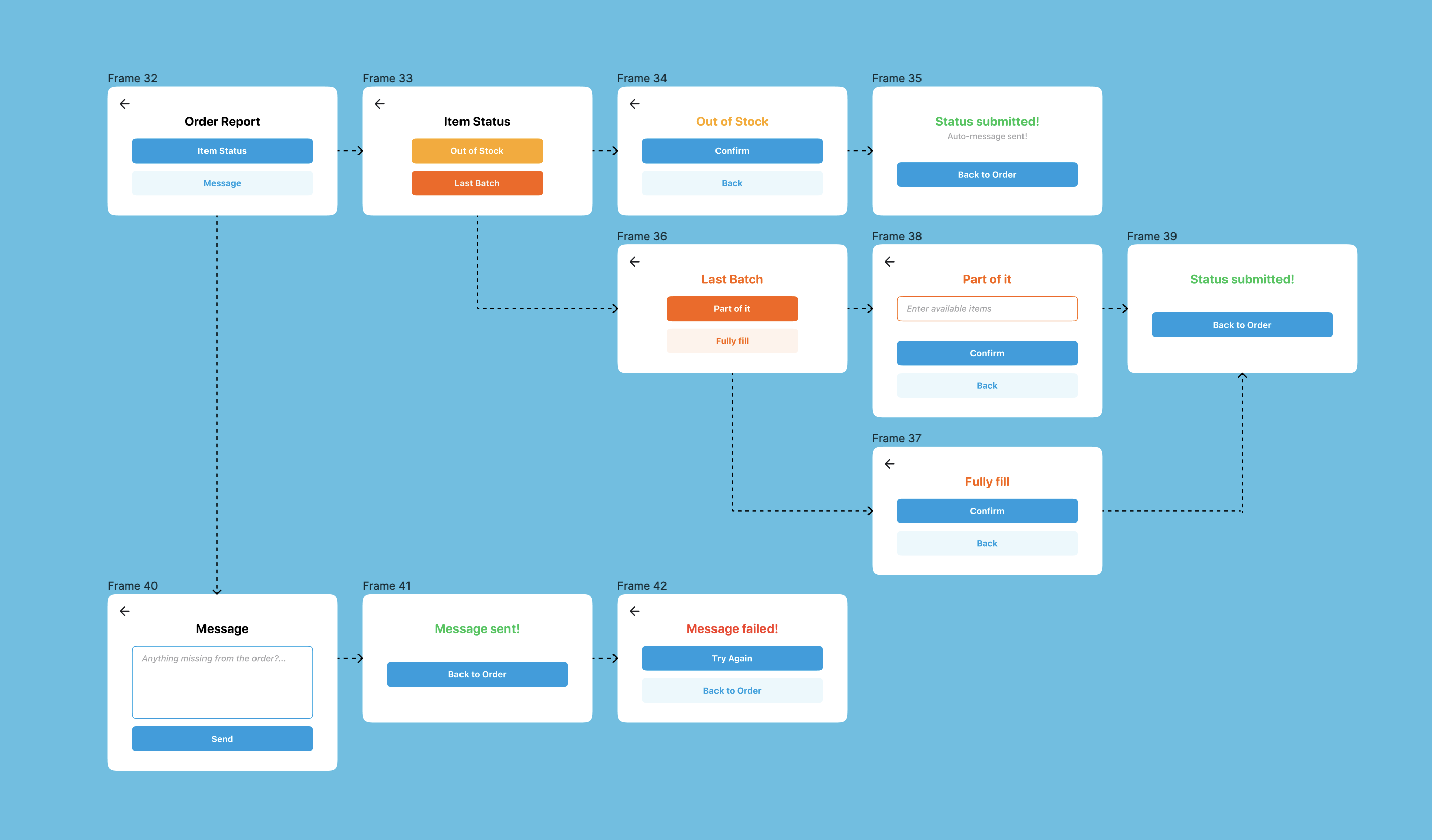
The idea of reporting did not solely come just to report every time something happened. It should be updated on the system and appear to the current as well as the next customer’s app. In the first prototype, I planned to include everything users need to report such as Sending message and Out of Stock. However, 4 options in this case still creates a certain amount of unnecessary cognitive load for them and they would not know which is the main action to choose.
Item Status includes Out of Stock and Last Batch. Out of Stock is the simplest action with buttons only and an auto-message to inform users whilst Last Batch contains 2 use cases.
The first is "Part of it" which means if the store has only 8 items out of 10 to fill, this function will send the auto-message including the number they can sell and then update this state to the system. This idea avoids surprising customers even with a note when they receive the orders and gives them a preparation beforehand looking for different suppliers.
Secondly, "Fully fill" belongs to Last Batch but for updating to the system only while users process the order. This state is used when the number of items ordered are also everything left in the shop.
The reason why this is my favorite part because it included my own method of research with users and a chance to experience the product in real life.
Before we start, this part was done from July to October, 2023 which means more than a year after my application to Wolt. However, as a UX designer, exploring and learning about products is my thing. I mentioned cashiers in the heading because this was done in a restaurant where I am working and we use the same app as shops.
Normally, the estimated time given to partners based on “nearest couriers” to the restaurant. It means if there are drivers standing outside our place, no matter how long the order is (5 items or 10 items), the given time was 5 minutes maximum. Although the app has a function to let us modify the time to match the preparation time, it became a disaster when we face rush hours especially for cashiers. To be clear, because the given time is always low (from 0 to 5 minutes), the cashier has to ask the chef every single time how long we need with each order (15 mins is minimum). However, their tasks were not only “Asking about time”, but Interacting with Eat-in customers, Preparing drinks, Serving food,Packing take-away...Therefore, if the calculation is improved, it will lift off a huge amount of workload for cashiers.
Yes, these are my solutions:
According to my interviews with 6 staffs at 3 restaurants about changing time for every order, they did not intend to report the issues or changes to Wolt but tried to figure out themselves. For the busiest of those 3, the cashier found it really annoying and stressful that they had to carry so much work at the same time (as I listed above). Meanwhile, in the less busy places, the cashiers were more to accept the problem because “We have time to change the given time.”
From this case, I came up with my first solution. How about a feature that allows users to enter the time they need to complete a particular order or item? However, there was another thing made me decided not to go with that. Because in restaurants, the speed of everybody is not the same, for example, between senior levels can complete orders faster than newbies. Even though the time range is acceptable, some people would have their own way to proceed orders and the time set would be changed in every shift.
Therefore, another idea pop-up in my head! How about a machine learning function that calculates the average time for every order? It could be fairly given to everybody and matched each situation especially in rush hours. In short, this feature will memorize how long an order with that item usually take and give an accurate estimate for the next time when the restaurant get it. As the algorithm keeps learning to adjust the number, the time is not fixed and yes, users are still able to change the time but not as essential as before.
Bonus, the first idea was actually run at Uber and listed in the Uber’s Partner Guide. In which, they have all the instructions needed for a partner to set up their Uber’s working system and time estimation can be input manually by users. You can check them here. (To be clear, I thought about this before reading their guides, and the idea is just coincident, not my “own” idea :D)
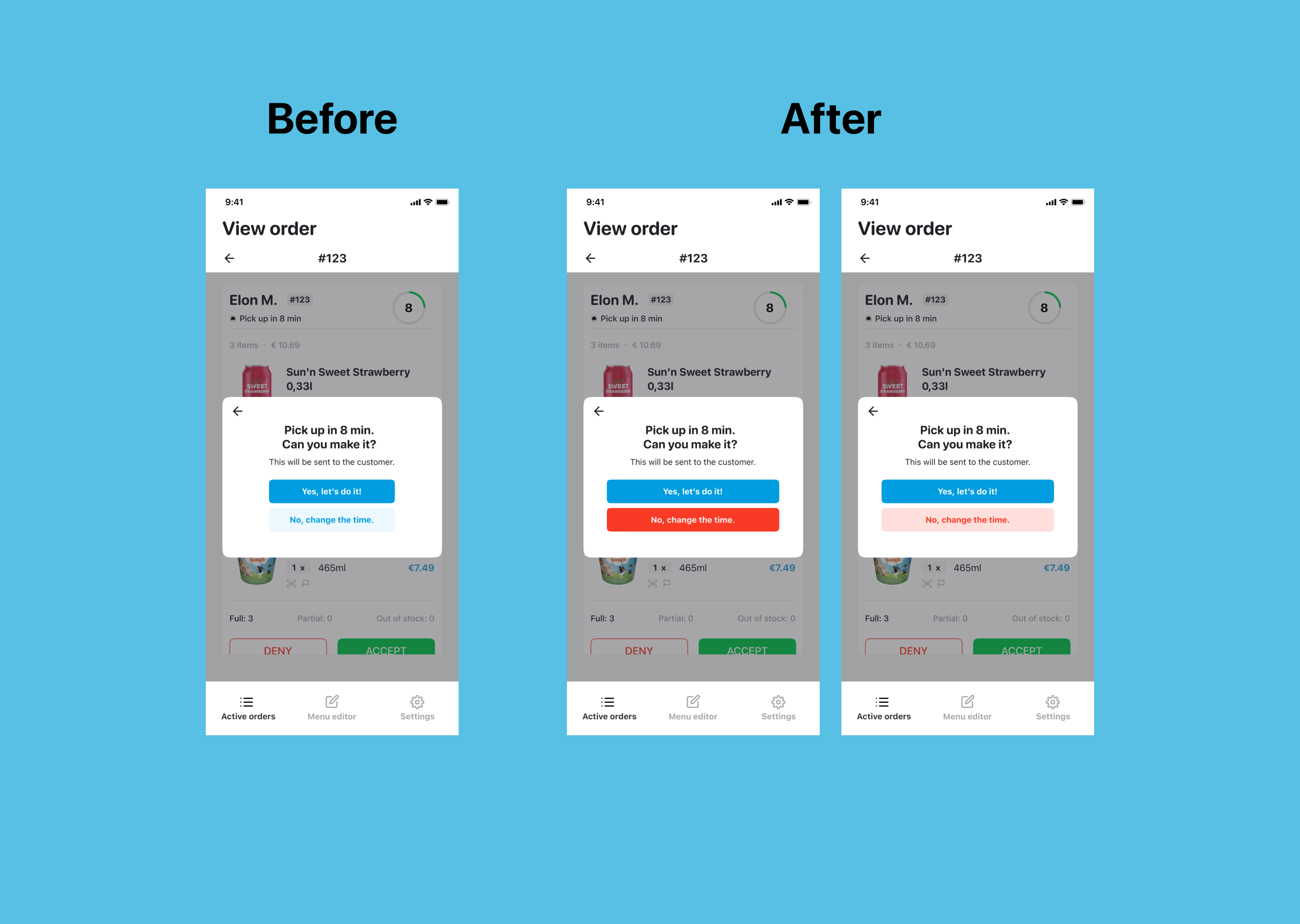
Most of the interviews were about how the time estimation works. But one user told me that she was always close to pressing the wrong button between “Yes, let’s do it” (with the given time) and “No, change the time” because their colors were not separated well. Imagine we are in the rush hours and you just accept a 45-minute order with a 5-minute estimation instead. All the fault will be in your hand and everything will be chaotic. Actually, other cashiers did not mention this but they made that mistake for a few times. To prevent such thing, I decided to interrupt the current color hierarchy by changing the button color and increase its salience. It created the balance of user attention for the 2 buttons and stopped them from tapping one of the buttons as a "Next" action.
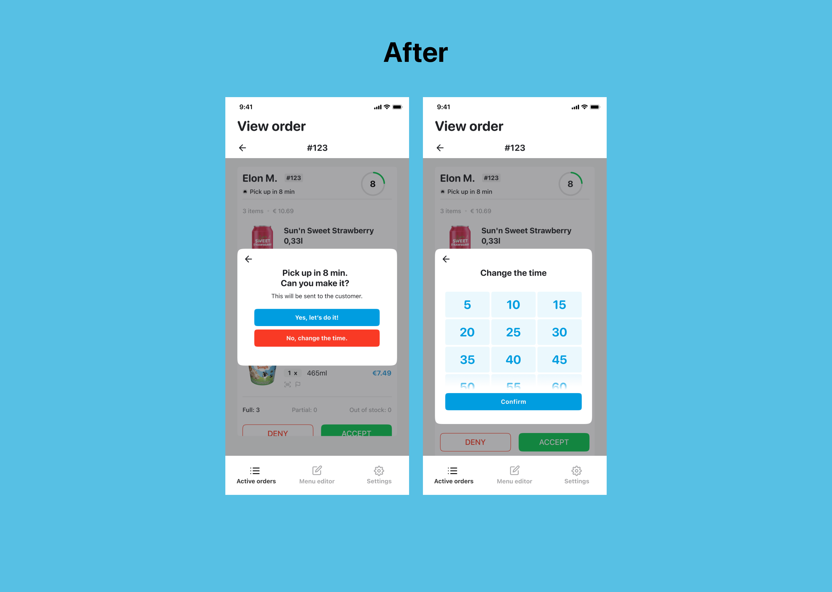
But the story does not end just here. After trying to work with the button color, I explored a function that requires a lot of effort for users to concentrate to complete. It was the Time Modification. You may ask What is actually wrong with that when users can do everything they want in this?
In the current design of Time Modification, users are given a range of selection from 5 to 25 minutes (includes 5, 7, 10, 15, 20 and 25). If they prefer a longer preparation, the app will change to a similar interface like the timer of iOS system. It means users need to scroll to an exact number they want. At first, it might look cool for simulating an interface that users are mostly familiar with. However, the drawback is that you have to mark the time carefully or “spin” to the correct number. In general speaking as well as what I observed, no one would give an odd number when they were asked for the time, but a multiple of 5 (5, 10, 15, 20, 25…). For example, if an order need to be done between 20 to 30 minutes, the possible given would be 20, or 25 or 30. No one would ever say 23, 26 or 29. In my opinion, a timer is not fully functional for this case. Therefore, I made another improvement for the app by expanding their current modification. By giving suggestion as touchable selection, the area is bigger to tap and also clearer for users to read which highly optimized usability at this point (Fitt’s Law).

The biggest challenge for this project was navigating the problem space. As being given with limited resources for the assignment, I needed to go through any material I could find about it like articles or reports, but ended up in App Store with a couple of sample screens. But that was enough for me to understand the user interface and how the userflow worked.
For the visual and UI design, I learnt how to manage not a complete Design System but a part of its components. It helped me to adjust some or all my design faster and more efficient instead of changing each element manually.
Order Management was also a new problem space for me. I had to keep bugging my UX friends and my restaurant colleagues to understand how the app actually worked. With this said, I got the chance to see the project in a different point of view by reading all the document of Uber Partner Guideline and by interviewing users. In my opinion, approaching users in a real-life environment requires time and context in order to have the closest result between what they said and what they actually did. Because if users don’t understand the concept as well as the surrounding is not what they are familiar with, the output would be like we are pointing the fault and convince them to believe. As I gave them the space to memorize and feel comfortable to collaborate with, they lead me through everything without a follow-up question.