Web Design
A/B Testing
Marketing templates
-
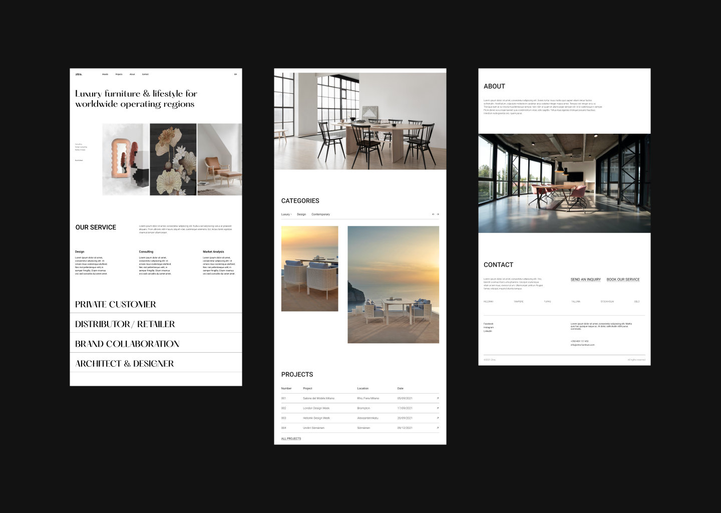
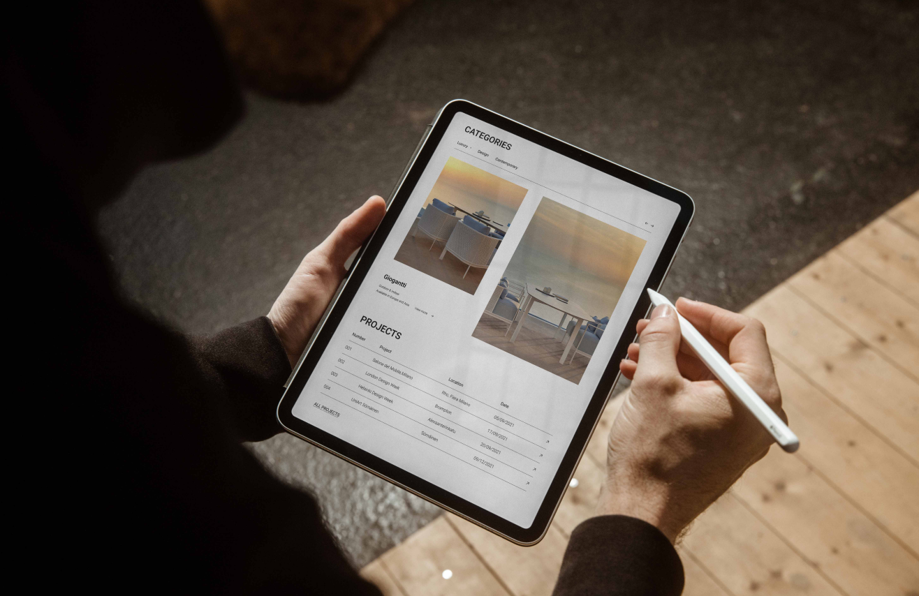
I was the sole web designer for the rebranding project of the Luxury Italian Furniture Agency. The new design reduced bouncing rate, and improved user visiting time by 110%.

IA, a premium furniture agency from Tuscany, serves as a vital link between their 40 European partners and customers in Asian regions. With the onset of Covid-19, there has been a notable increase in demand for online materials over traditional catalogue requests.
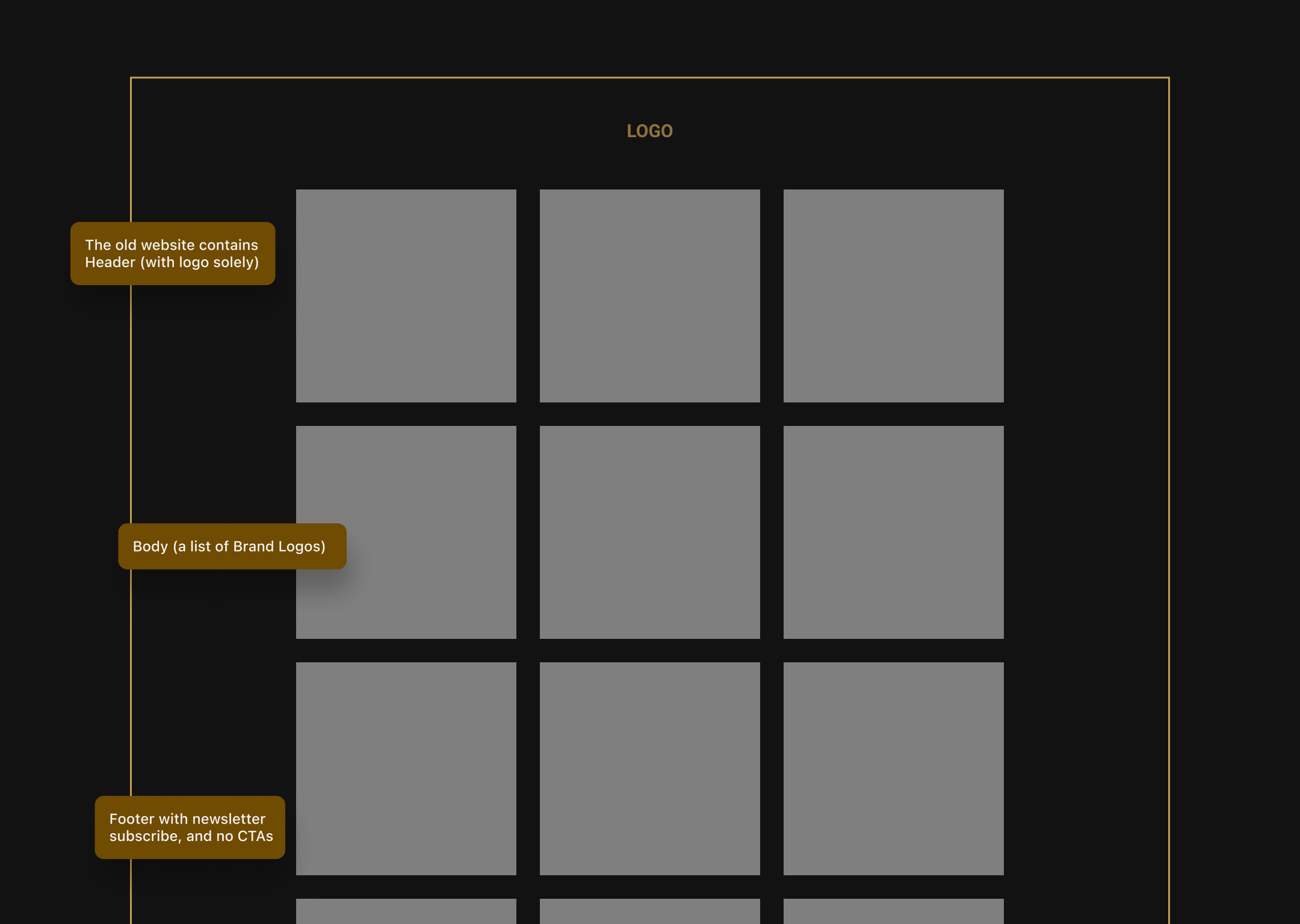
Established in 2008, the company's information-centered website style has limited its ability to reach a diverse range of customers beyond its existing client base. As the business continues to expand, a more dynamic and engaging online presence is essential, going beyond a mere list of partners or static product images.
First of all, I need to understand the brief of what their business model is. Because they are a furniture agency that only provides services such as consulting and transiting the oder; and does not sell products directly.
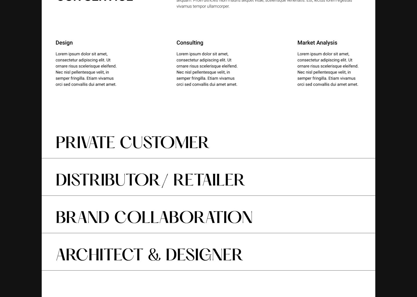
Secondly, because they have a different flow for their markets and irregular groups of audience; therefore, their 4 targeted groups for the new website include:
Thirdly, from my learning and as happened before, clients usually want to display all the information they have or I may call it the information-centred. In this case, I discussed with them how many parts of information they want to show which would be later added to the navigation bar and in order to not overload the users. Additionally, as their main theme is about educating users through exclusive information such as interviews with the brand’s CEOs and managers, the number of pictures should be placed at a certain level to avoid being mistaken with a usual e-commerce website.
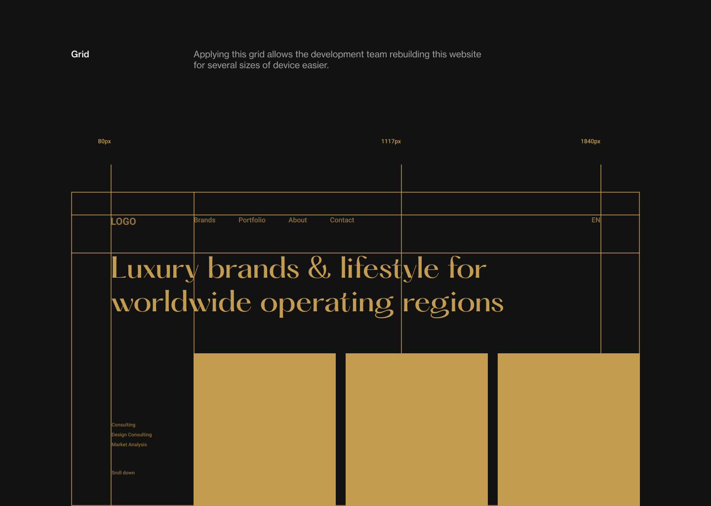
Fourthly, luxury is the main theme of website and it involves not only the company’s identity but also their brands. Because of that, it needs to go side by side with aesthetic to match both parties and attract the users too.
The client wanted something bold and elegant but not outdated, so I basically chose a serif font called Hatton for the headings and the popular Roboto for the body text.

The brownie yellow was kept from their logo’s color that they would like to combine it with the black to emphasize the luxury.